Fox & Quills Ink
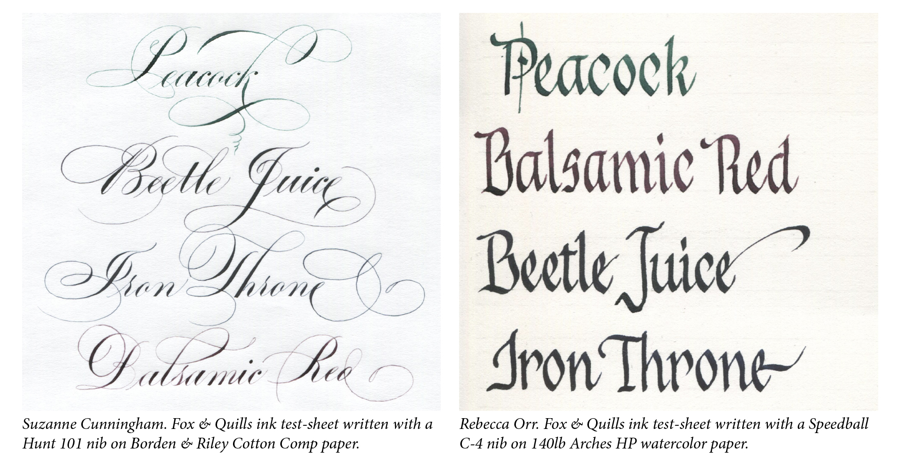
Fox & Quills is a small company that brews small-batch inks of two kinds. Some are pure gall inks with some added pigment – their Beetle Juice, Iron Throne. Others are a mix of iron gall (15-20%) and pigmented inks (85-80%) – their Peacock, Balsamic Red. I sent samples of four inks to two scribes, Suzanne Cunningham and Rebecca Orr. Suzanne tested them with a pointed nib, and Rebecca used a broad-edged nib. Their comments and tests are below. –John Neal
Suzanne Cunningham: All four of the Fox & Quills inks write incredibly well. I tested them using Gillott 404 and Hunt 22 and Hunt 101 nibs on Borden & Riley Cotton Comp, Strathmore Writing paper, and both hot-press (HP) and cold-press (CP) watercolor papers. Hairlines were very fine, which is always the goal. Each of the inks flowed really well off the nib, and they seemed to last quite a while before the ink ran out and railroaded. None were overly corrosive (not any more than other iron gall inks).
As far as the individual colors go, Fox & Quills Beetle Juice and Balsamic Red inks started out almost identical. The hairlines on the Balsamic Red were slightly more reddish, and the Beetle Juice seemed a little more purple-ish; the shades (thick strokes) were very close in color. But the Beetle Juice darkened with a little time and became a very dark purple. The Fox & Quills Peacock ink is such a beautiful color – just the right mix of blue and green; the hairlines are slightly more vibrant than the shades. The Iron Throne ink is probably my favorite – such a gorgeous color of navy, but with slightly black undertones. It’s very classic, but with a twist.
Rebecca Orr: I tested these Fox & Quills inks using a Speedball C-4 nib and love them all. Because all of these inks are the consistency of water (like Pelikan 4001 fountain pen ink), I had to be careful not to overload the nib. I tested on the following papers: Stonehenge, 140lb Arches HP watercolor, and Arches Text Wove.
All of the inks did very well on all of the papers, no bleeding whatsoever. What was interesting to see was the color difference between the papers.
On Stonehenge, the Peacock and Balsamic Red inks were much brighter in color, which was not a surprising result knowing that these two inks are not fully 100% iron gall inks, and Stonehenge was the whitest paper of the three.
I really liked the brown-red hue of the Balsamic Red ink. Both the Beetle Juice and Iron Throne inks (both true iron gall inks) oxidized fairly quickly, and they are almost 100% black on all the papers, though they have slight undertones of red (Beetle Juice) and blue (Iron Throne).

For online classes with Suzanne Cunningham: https://www.learncalligraphy.com/suzanne
To commission work: suz822cunningham@gmail.com
Suzanne on Instagram: https://www.instagram.com/suzcunningham/
Recent Posts
-
Calligraphy Wisdom: Advice from Seasoned Artists & Answers for Beginners
At John Neal Books, we love connecting with the calligraphy community and sparking insightful di …Mar 11th 2025 -
October 2024 - New Products
S202 …Nov 8th 2024 -
Paul Antonio wants your help!
Paul Antonio is putting out a call to Copperplate calligraphers of all skill levels. Any in …May 22nd 2024


